
Maps, Timelines, and Data Scenes for AI Documentaries
Choose the right map, timeline, chart, globe, whiteboard, or text scene for each claim in an AI documentary video.
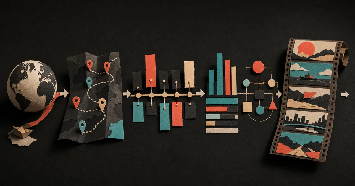
Use a map when the viewer must understand where something happened or moved, a timeline when order and elapsed time matter, and a data scene when the argument depends on magnitude or comparison. The best scene type answers the narration’s central question directly. It should clarify the claim, not simply make the frame look busy.
Documentary visuals work when they reduce the viewer’s mental workload. A port route becomes easier to grasp when it moves across a map. A ten-year collapse becomes clearer when its turning points share one timeline. A “three times larger” claim becomes visible when both values appear in the same scale.
This guide explains how to make those choices inside a scene-based AI video workflow.
Choose the scene by the question it must answer
| Viewer question | Best starting scene | Essential elements | Common mistake |
|---|---|---|---|
| Where is it? | Map or globe | Named locations, scale, region, clear focal point | Showing a decorative map without orienting the viewer |
| How did it move? | Route map | Origin, destination, direction, stops, sequence | Animating every route at once |
| What happened first? | Timeline | Dates, events, intervals, turning point | Giving every event equal weight |
| How large was the change? | Data scene | Metric, units, baseline, comparison, source | Using a dramatic chart with a misleading scale |
| How does the system work? | Whiteboard or diagram | Parts, connections, ordered reveal, labels | Displaying the entire mechanism before explaining it |
| What should I remember? | Kinetic type or title card | One short statement, visual hierarchy, enough reading time | Turning full narration paragraphs into on-screen text |
Maps answer “where?” and “how did it move?”
A map earns its place when geography changes the meaning of the story. It can establish location, show distance, compare regions, trace movement, or reveal a bottleneck.
Suppose the narration says: “The package crossed two oceans, three sorting hubs, and a congested final-mile network before reaching the customer.” A generic clip of a delivery van shows the category. A route map shows the system.
A useful map scene needs a specific job:
- Locate: move from the world to one country, city, or facility.
- Connect: draw the relevant route between named points.
- Compare: place two regions in the same visual frame.
- Constrain: reveal a border, channel, mountain range, hub, or service radius.
- Change: show territory, access, or activity across time.
Keep the first frame simple. Give the viewer one stable location before adding routes or labels. Then reveal information in the same order as the narration. If the voice says Cairo, Athens, and Rotterdam, the map should not highlight all three long before the words reach them.
When to use a globe instead
A globe is useful for global scale, opposite sides of the planet, orbital paths, or a transition from the whole world into a region. It is weaker for detailed local routes because curvature and camera movement can compete with the labels.
Use the globe to establish scale, then hand the explanation to a flatter map when the route needs inspection.
Timelines answer “when?” and “what changed?”
A timeline is more than a row of dates. It shows relationships between events: long silence, rapid acceleration, overlap, delay, repetition, or a turning point.
Start by deciding what the timeline proves. If the argument is that a decline happened slowly, preserve the intervals. If the argument is that three decisions arrived in six weeks, show the compression. Do not distribute events evenly merely because equal spacing looks tidy.
A strong timeline scene usually contains:
- a visible start and end range;
- only the dates needed for the current argument;
- a clear active event;
- different emphasis for background and turning points;
- a transition that explains why the next event follows.
If the narration introduces twelve dates, consider multiple scenes. One overview can establish the full period, then chapter-specific timelines can focus on the relevant section. The viewer should not need to hunt across a crowded frame while listening.
Data scenes answer “how much?”
Data scenes are useful when a number is part of the reasoning. The scene might compare two values, show change over time, reveal a share of a whole, count toward a threshold, or expose a gap between expectation and reality.
Before designing the scene, write the claim in plain language:
- Revenue doubled while delivery cost tripled.
- One region represented most of the growth.
- The delay fell after the second intervention.
- The smaller group produced a disproportionate result.
Then choose a form that matches the relationship. Bars are good for discrete comparisons. Lines are useful for change over time. A proportion or progress form can show part-to-whole. A single large number can work when the value itself is the conclusion.
Always give the number a frame of reference
“Forty million” means little without a unit, date, geography, or comparison. On screen, include the minimum context a viewer needs:
- what is being measured;
- the unit;
- the period;
- the comparison or baseline;
- the source, where the scene makes a factual claim.
Do not use decorative motion to hide a weak comparison. A data scene should remain understandable if paused.
Whiteboards and diagrams answer “how does it work?”
Some documentary subjects are systems rather than events. Money passes through several parties. A signal moves through a network. Inventory moves from factory to warehouse to store. An incentive causes behavior at one stage and consequences at another.
A whiteboard or diagram can reveal that mechanism one link at a time. Start with the main actors or components, then add arrows only as the narration explains the relationship. Color should carry a stable meaning: one color for money, another for goods, another for risk, for example.
Avoid the temptation to build a complete technical diagram when the scene only needs one causal chain. Documentary graphics are not documentation. Their job is to make the current passage clear without creating a new puzzle.
Kinetic type answers “what should stay with me?”
Text scenes work when a short phrase deserves emphasis: the thesis, a contradiction, a chapter turn, a quotation, or a final consequence.
Keep the copy shorter than the spoken sentence. The voice can provide nuance while the screen holds the core idea. If every sentence becomes kinetic type, emphasis disappears and the viewer is forced to read continuously.
Useful text scenes include:
- a chapter title that resets context;
- a date that marks the turning point;
- a brief quotation with clear attribution;
- a two-part contradiction;
- the final answer to the opening question.
Generated and archival imagery answer “what did it look or feel like?”
Not every scene is explanatory. A documentary also needs people, objects, texture, atmosphere, and a sense of place. Real footage, archival sources, licensed images, screenshots, and generated illustrations can all contribute.
Use traceable real material when the image is evidence. Use generated or illustrative material when it is interpretation, reconstruction, atmosphere, or an unavailable concept. Do not allow a realistic reconstruction to quietly pose as a record of an event.
The guide to scene-based AI video versus stock footage covers that boundary in more detail.
See the whole sequence before rendering
A useful scene can still fail when placed beside the wrong neighbors. Three maps in a row may feel repetitive. A data scene after another dense graphic may overload the viewer. A quiet archival image can create the breathing room the sequence needs.
Veedyoo keeps each scene’s narration, timing, visual direction, generated media, and position in the wider documentary together.
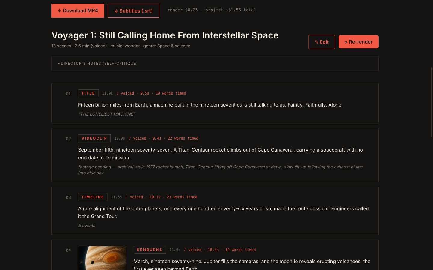
The same plan can move into a multi-track editor for scene timing, narration, music, captions, and overlays. This is why the AI documentary workflow starts with a production plan rather than a single text-to-video prompt.
A five-pass method for assigning scene types
Pass 1: Highlight factual anchors
Mark every person, date, location, number, quotation, and source-dependent claim. These are the parts most likely to require verification, attribution, or real evidence.
Pass 2: Label the question
For each paragraph, choose the viewer question: where, when, how much, how it works, what it looked like, or what matters. If a paragraph answers several questions, it may need more than one scene.
Pass 3: Assign the smallest useful scene
Choose the simplest form that makes the claim clear. Do not use a 3D globe when a labeled two-point map is enough. Do not use a multi-series chart when two bars answer the question.
Pass 4: Plan the reveal
Write what appears first, what changes, and what remains on screen. Match the reveal to the narration. A storyboard note should describe the purpose and sequence, not only the final appearance.
The script-to-storyboard guide gives a reusable prompt structure for those production notes.
Pass 5: Review rhythm and continuity
Zoom out. Alternate dense explanatory scenes with simpler visual moments. Reuse colors, label positions, type styles, and camera language. Make sure similar scene types behave consistently throughout the film.
Accuracy checks before a scene is final
AI can help propose a scene, but it does not remove the need to check the claim. Before rendering:
- verify names, dates, numbers, routes, and units against the underlying sources;
- label illustrative values or scenarios as illustrative;
- use honest map boundaries and scales appropriate to the claim;
- avoid truncating chart axes in ways that exaggerate a difference;
- distinguish real, archival, illustrative, and synthetic imagery;
- confirm that source material and generated assets can be used for the intended publication;
- preserve source notes outside the frame even when the visual only shows a short citation.
These checks matter more than decorative polish. A beautiful scene that changes the meaning of the evidence weakens the film.
Build the plan before buying the assets
Maps, generated images, voice, transcription, revisions, and rendering can all consume credits, subscription allowances, cloud usage, or editing time. Review the structure first, then produce what survives.
The guide on how to make an AI documentary video covers the complete sequence from angle and research to storyboard, review, and final render. The cost comparison explains how different billing models affect that production sequence.
With Veedyoo, you can begin with included credits and use pay-as-you-go top-ups from $5 instead of a recurring subscription.
Frequently asked questions
What scenes should an AI documentary include?
Include only the scene types the story needs. A typical project may combine real or generated imagery with maps, timelines, data scenes, diagrams, chapter titles, captions, and quotations. Variety helps only when every format has a clear editorial job.
When should I use a map instead of a globe?
Use a globe to establish worldwide scale or move between distant regions. Use a flat map when viewers need to inspect a route, border, cluster, local relationship, or several readable labels.
How many dates should appear on one timeline?
There is no fixed number. Use as few as the current argument requires and keep the active event obvious. Split a crowded historical overview into several scenes when the viewer cannot read the dates and follow the narration at the same time.
Should a data scene cite its source on screen?
When the scene makes a factual claim, a concise visible source improves transparency. Keep full citation details in the description, notes, or accompanying article as appropriate. A source label does not replace checking that the data and comparison are accurate.
Can AI choose the scene type automatically?
It can propose a treatment from the narration, but the creator should review whether the scene answers the intended question, represents the evidence honestly, and fits the rhythm of the wider film. The decision is editorial, not merely technical.
Turn the claim into the right scene
Plan an AI documentary in Veedyoo with maps, globes, timelines, data scenes, diagrams, generated imagery, narration, and an editable timeline.
Plan a documentary